Use HTML to create simple graphs for your data.
It seems as though every site you go to these days requires QuickTime or Flash so that you can see fancy images and graphs. For simple bar graphs, though, you don't need fancy image rendering or Flash movies. You can use this hack to create bar graphs with just a few HTML tables and some PHP. The result looks just as cool as those other Flash-heavy sites but doesn't require any extra plug-ins or downloads.
The Code
Save the code in Example 1 as htmlgraph.php.
Example 1. Drawing some simple bar graphs
<html>
<?
$data = array(
array( "movies", 20 ),
array( "food", 30 ),
array( "workout", 10 ),
array( "work", 40 )
);
$max = 0;
foreach ( $data as $d ) { $max += $d[1]; }
?>
<body>
<table width="400" cellspacing="0" cellpadding="2">
<? foreach( $data as $d ) {
$percent = ( $d[1] / $max ) * 100;
?>
<tr>
<td width="20%"><? echo( $d[0] ) ?></td>
<td width="10%"><? echo( $d[1] ) ?>%</td>
<td>
<table width="<? echo($percent) ?>%" bgcolor="#aaa">
<tr><td> </td></tr>
</table>
</td>
</tr>
<? } ?>
</table>
</body>
</html>
You can use several techniques to create HTML graphs. I chose to use two tables; the first contains the textual data, and the second contains a set of nested tables, each with a width value based on the graph value in that row.
I calculate the width by first finding the maximum value of the combined data, and storing that in $max. I then derive the percentage by dividing $max by the current value, and multiplying the result by 100 (to set the scale between 0 and 100). That number is stored in $percent, which is then used in the width attribute of the table.
Running
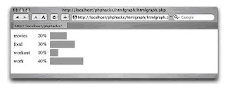
Use your browser to surf to the htmlgraph.php page. You should see something similar to Figure 1
Figure 1. The simple HTML graph as seen in Safari

Start Running
I admit that gray is not the prettiest color for a graph, so Example 2 is a slightly altered version of the script, which adds a little color to the data.
Example 2. Adding a splash of color
<html>
<?
$data = array(
array( "movies", 20, "red" ),
array( "food", 30, "green" ),
array( "workout", 10, "blue" ),
array( "work", 40, "black" )
);
$max = 0;
foreach ( $data as $d ) { $max += $d[1]; }
?>
<body>
<table width="400" cellspacing="0" cellpadding="2">
<? foreach( $data as $d ) {
$percent = ( $d[1] / $max ) * 100;
?>
<tr>
<td width="20%"><? echo( $d[0] ) ?></td>
<td width="10%"><? echo( $d[1] ) ?>%</td>
<td>
<table width="<? echo($percent) ?>%" bgcolor="<? echo($d[2]) ?>">
<tr><td> </td></tr>
</table>
</td>
</tr>
<? } ?>
</table>
</body>
</html>
The new third value is used to set the background color of the bar graph table. This gives the output a rainbow look that is a little nicer on the eyes than the gray version.
0 komentar:
Post a Comment